Color Club Wild At Heart vs China Glaze LOL
With my sunshine fleeting, I wanted to quickly get a side by side of Color Club "Wild At Heart" and China Glaze "LOL". Right off the bat, you can see from the bottles that these are not duplicates at all. The Color Club bottle is a deeper purple and the holographic effect looks more like a glitter whereas China Glaze is a more blue purple with a pronounced rainbow holographic effect.
In the sun, you see the same result:
Oh the loveliness. Sadly, in the shade, everything is dulled, but you can see the pigment difference in the two bottles.
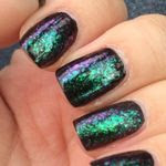
Check out those amazing cuticles. Yeah, I was in a super rush as you can tell. I'm actually embarrassed by it! I also need to start really investing in my cuticle oils - making sure that they are moisturized and pretty for you.
Color Club is located on several etailers, including Head2Toe Beauty [official website].
Disclosure: The product[s] in this post was [were] provided to me by the company for consideration. For more information, please read this post.